Discover Pro features four ribbons, exposing a range of functionality that can be used to customize the query, and change the report and visualization design and formatting.
These features offer the user a tremendous amount of flexibility when it comes to querying the data model. They also give the user great freedom in terms of defining the look and feel of the data discovery.
Run Query
The Run Query button (orange highlight below) is the first function in the ribbon, and is displayed regardless of the currently selected ribbon. This button is used to manually run the query when the auto run function is disabled, or when changes are made to the query from the elements panel.
Ribbon Selection
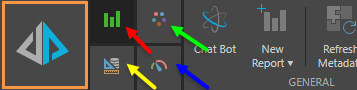
There are four ribbons which you can toggle between: the report (red arrow above), design (green arrow), component (blue arrow), and query (yellow arrow) ribbons. To access the required ribbon, simply click it's corresponding button as indicated in the image below:
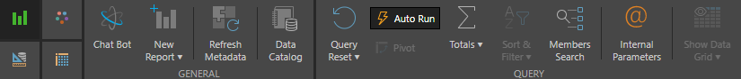
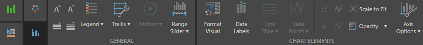
Report Ribbon
The Report Ribbon offers quick access to a range of commonly used tools, including a handful of query functions, along with formatting functionality that is applied at the report level. The Report Ribbon also provides access to the extended functionality offered by Report Actions and Conversations.
 Report Ribbon Functions
|
Function |
Description |
|---|---|
|
Open the Actions wizard to define actions for the query. |
|
|
Enable Auto Run to automatically run the query when chips are selected/ added to the drop zones. If you choose to disable Auto Run, you can manually run your queries by clicking the main Pyramid button |
|
|
Click the drop down and select a visualization type from the menu. |
|
|
Open the chat bot to query the data model by asking analytical questions in plain English, |
|
|
Workflows and Conversations |
Click to open the Workflow or Conversations panel. |
|
Formatting |
Use the font size icons to enlarge or shrink the font size. Use the font color icon to change the color of the title. Use the paint icon to change the canvas color. |
|
View, edit, or delete quick variable list parameters. |
|
|
Use the Members Search wizard to quickly search for members and add them to the query or save them as a list. |
|
|
Click to open a new Discovery window. To copy a report, click the drop down and select Duplicate. |
|
|
Switch the columns with rows, or reverse the x and y axes. |
|
|
Click to remove all selections and reset the query. |
|
|
Refresh the metadata in the trees, and the folder tree if showing business logic. |
|
|
The workspace refers to the panels that make up the Discover module (Dimensions, Measures, Elements, and Drop Zones). These panels can be moved and placed in the make docks on either the right or left hand-side of the canvas. Click Workspace Type to undo any changes made to the workspace. Click the drop down to choose a preset. |
|
|
Split the canvas horizontally or vertically and show the raw results nest to the visualization you've built. |
|
|
Sort & Filter |
Configure sorting and filtering preferences via the Sort Wizard and the Filter Wizard. Click the drop down and select either sort or filter. You can also remove previously applied sorts and filters from this drop down. |
|
Click to add grand totals to a grid. Select the drop down to configure totals rows and/or columns from the dialog. |
 in the top left hand corner. When the query needs to be run, the following alert will appear:
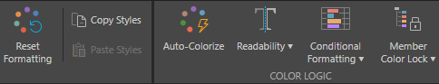
Design Ribbon
The Design Ribbon exposes functionality that enables the user to customize the design of the entire report. The tools here are applied at the report level, meaning they affect the entire data discovery, rather than specified elements within it (such as the query, or given visualization elements).
From here, the user can select a design theme for the report, and change the report background color and the report title color. They can also govern the report's runtime settings to determine what functionality will be exposed in the report when it's viewed, and add notes to the report.

Design Ribbon Functions
|
Function |
Description |
|---|---|
|
Click to colorize measures in the visual. |
|
|
Copy styles form one report and paste them into another. |
|
|
Select a design template form the Design panel. To view all templates, click the bottom arrow. |
|
|
Change the title color from the font color icon. |
|
|
Report Background Color |
Change the background color of the report. |
|
Hides tooltips that are used to expose detailed properties of member elements. |
|
|
Show or hide query info captions. |
|
|
"Hard-code" color allocations to specific hierarchy members in a given report. |
|
|
Change the tolerance of the readability logic to enable a broader combination of colors. |
|
|
Customize the visualization's title and title font. |
|
|
Use this button to undo all selected formatting options. |
|
|
Customize which runtime settings should be enabled. |
|
|
Enable Notes to open the notes panel along the bottom of the UI. |
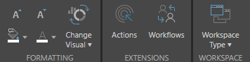
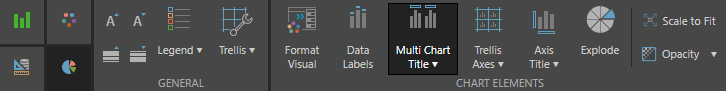
Component Ribbon
From the Component Ribbon, users can customize the formatting and design at the visualization level. This ribbon offers formatting choices that affect the look and feel of the current visualization. The functions exposed in the Component Ribbon depend of the currently selected visualization type, with each function developed to address the various formatting and design considerations that are specific to the corresponding visualization.
For example, when a line chart visualization is selected, options are exposed to change the line and data point style and size. If the visualization is changed to a grid, the Component Ribbon exposes functions that allow the user to customize row and column size, and even to customize font at the row, column, and data cell levels.
Cartesian Charts
Users can preview the properties of each particular visualization for Cartesian Charts.
- For more information see Chart Gallery Presets.
Grids

Segment Charts
Component Ribbon Functions
|
Function |
Relevant Visual Type |
Description |
|---|---|---|
|
Matrix Grid |
Select the drop down to reposition the grid on the canvas. Only available for matrix grids. |
|
|
Grid, Raw Results |
Display every other row in gray. |
|
|
All charts except Map |
Show or hide axes labels. Click the drop down and select More to change font. |
|
|
Matrix Grid, Tabular Grid, Raw Results |
Customize the axes font and alignment. |
|
|
Charts |
Use a common scale, shared y-axis, shared x-axis, and select axis formats. |
|
|
Scatter Charts |
Click the drop down to select the position of the axis. |
|
|
All charts except Map |
Hide or show axes. |
|
|
Background |
Change the background color of the visualization. |
|
|
Border |
Change the color of the visualization borders. |
|
|
Border Formatting |
Use the border icons to make the visual's borders thicker or thinner. |
|
|
Matrix Grid, Tabular Grid, Raw Results |
Toggle on to auto fit columns to the appropriate size to display the data in the cells. |
|
|
Matrix Grid, Tabular Grid, Raw Results |
Customize the cell font and alignment. |
|
|
All charts except Map |
Add value labels to charts. |
|
|
Line, Area, and Scatter Charts |
For line and area charts, click to show data points. For scatter charts, click the drop down to select the type of data point. |
|
|
Matrix Grid |
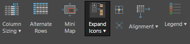
Use the Expand Icons to expand down to the next level in a grid. These will only operate on regular hierarchies. |
|
|
Pie, Pyramid, Funnel Charts |
Separate the segments. |
|
|
Font |
Gauges |
Select a font color. |
|
Format All |
Grid |
The functions available from the Format All section of the grid component ribbon are used for formatting of grids, grid rows, columns, cells, and headers. They can also be used to configure contextual formatting. Click here to learn more. |
|
Map Charts |
Specify a country and state. |
|
|
Matrix Grid |
Click the drop down to choose between matrix mode and flat mode. Only available for matrix grids. |
|
|
All charts except Pie and Map |
Show or hide grid lines. Click the drop down to select from different types of grid lines, or select More to configure grid lines manually. |
|
|
Matrix Grid, Tabular Grid, Raw Results |
Add padding to the grid cells. |
|
|
Grids |
Hide or show headers. Change header font and colors by clicking the drop down and selecting More. |
|
|
Label Alignment |
Gauges |
Align the gauge labels. |
|
Labels |
Gauges |
Click the drop down and select Edit Labels to edit the labels for the Target and/ or Value. |
|
Legend |
Enable or disable legends. Click the drop down to reposition the legend, and click more to change the legend's font, borders, and background color. |
|
|
Line, Area Charts |
Toggle the line icons to make the line thicker |
|
|
Map Charts |
Change the color of the countries and the water. |
|
|
Map Charts |
Select a map type from the drop down menu. |
|
|
Grid |
Enable the mini map to navigate large grids for easily. |
|
|
Column, Bar, Line, Area, Scatter Charts |
When working with the motion drop zone, position the Motion component and determine the motion speed. |
|
|
Drop a date hierarchy into the Motion drop zone to see the visualization change over time. |
||
|
All charts except Map |
Add a title to charts. |
|
|
All charts except Map |
Reduce the opacity of chart visuals. |
|
|
Scatter Charts |
Toggle the point icons to adjust the size of the data points. |
|
|
Matrix Grid, Tabular Grid, Raw Results |
Scale a grid down to fit on the canvas. |
|
|
Text Formatting |
Use the text icons to enlarge and shrink the visual's font size. |
|
|
Title Alignment |
Gauges |
Align the gauge titles. |
|
Title Text |
Gauges |
Toggle gauge titles on and off. |
|
All charts except Map |
Enabled when charts are trellised. Add the measure to each chart's y axis as an additional label. |
 or thinner
  .
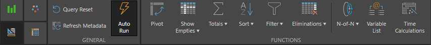
.Query Ribbon
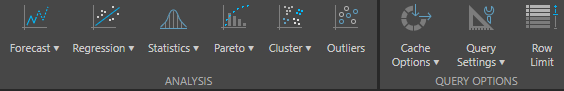
The Query Ribbon offers a range of tools aimed at customizing the query itself. Because these functions are performed at the query level, they affect the data that is returned in the visualization. The tools in the Query Ribbon include sorting and filtering, time intelligence calculations, and advanced analysis tools like forecasting.
Query Ribbon Functions
|
Function |
Description |
|---|---|
|
Enable Auto Run to automatically run the query when chips are selected/ added to the drop zones. If you choose to disable Auto Run, you can manually run your queries by clicking the main Pyramid button |
|
|
Click the drop down to enable or disable cache, or revert to the model's default cache options. |
|
|
Click the drop down to select a language. Choose Default to select the default language set in the cube. Note: Available only with MS OLAP, Tabular and SAP models. |
|
|
Eliminations |
Use the Eliminations wizard to eliminate specified members from the query. |
|
Filter |
Configure filtering preferences via the Filter Wizard. Click the drop down and select filter. |
|
Forecasts |
Use forecasting to project future values in a time series, such as sales over the next quarter. |
|
K-Means Cluster |
Use the K-Means Cluster algorithm to divide your chart into k clusters. |
|
Click to enable colors defined in the cube. Available only with MS OLAP and Tabular models. |
|
|
Click to enable formats defined in the cube. Available only with MS OLAP and Tabular models. |
|
|
N-of-N |
Open the N-of-N wizard to configure nested loop queries. |
|
Outliers |
Divide your chart into "in" an "out" to show outliers. |
|
Switch the columns with rows, or reverse the x and y axes. |
|
|
Click to remove all selections and reset the query. |
|
|
Query Settings |
A set of optimization switches that can be used to tweak the manner in which a query is executed. To learn about Query Settings, click here. Available only with MS OLAP, Tabular and SAP models. |
|
Refresh Metadata |
Refresh the metadata in the trees, and the folder tree if showing business logic. |
|
Regression Line |
Use regression lines with charts (not including pie, doughnut, pyramid, funnel, and map charts) to calculate trend regressions, using one of four models against a data series in the chart. |
|
Click to show empty rows and columns. Click the drop down to show or hide all empties. |
|
|
Sort |
Configure sorting preferences via the Sort Wizard. Click the drop down and select sort or filter. |
|
Use the Statistics functions with charts (not including pie, doughnut, pyramid, funnel, and map charts) to integrate statistical information within the plot area of the chart, and view the average or median on top of the chart. |
|
|
Time Calculations |
Use the Time Calculation wizard to quickly build complex formulas based on time. |
|
Click to add grand totals to a grid. Select the drop down to configure totals rows and/or columns from the dialog. |
|
|
Variable List |
Open the Variable Lists wizard to quickly build variable sets on the fly within Discover. |